
Hello all.
I have a question about displaying a warning message or an error in a button. I am not convinced if it’s a good idea, so I would like to hear your opinion.
Let me first explain the situation.
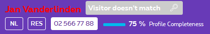
We have a platform we use when we talk to visitors in real shops. When a sales agent starts the conversation, we do a search in the DB to see if we have a match with an existing customer. When we have a match, the name of the visitor/customer is displayed in the header. Next to the name, there is a small search button where you can go to the search page in case you want to search for another customer
It is also possible that we don’t have a match (no customer found, or more than one match possible). Is it ok than to mark the name of the visitor and put a message in the search button which explains what is wrong, or why you have to click on the search button, because there you can solve the problem.
Or does somebody has a better solution to deal with this kind of issues?
Thanks!