
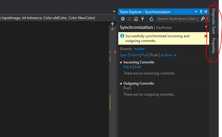
hi!, I have an UI design question: I have an application where there are windows docked to the right of the UI, when these windows still minimized are shown with a vertical text, just like “solution explorer”, “Diagnostics tools” in Visual studio. In many Microsoft products (outlook, VS, Management Studio, etc.) the text of the vertical docks is shown written from top to bottom. There are some people that think that is wrong. Is there a design pattern that indicates how to write vertical text?. If not, What do you think is the right way?
1 Like
Hi there,
Can you include screenshots? It’s easier to visualise that way. 
2 Likes
I’m not aware of a design pattern against such approach.
I believe that is a matter of fact that delivering a label in that way will not help the users.
Said that I would evaluate the case in this way:
Of course, if those two labels are not the primary actions during the user journey, with the learning curve users will learn how to interact with them.
If those two labels are important to accomplish the task I would definitely design a different solution.
1 Like
I think it should be a generally accepted rule of UX that if your users are doing this…

…you’ve done something wrong.
This. So much.
Do not use vertical text. There’s always a better solution.
3 Likes