Hi everyone!
question for UI designers, anyone else is welcome to comment as well 
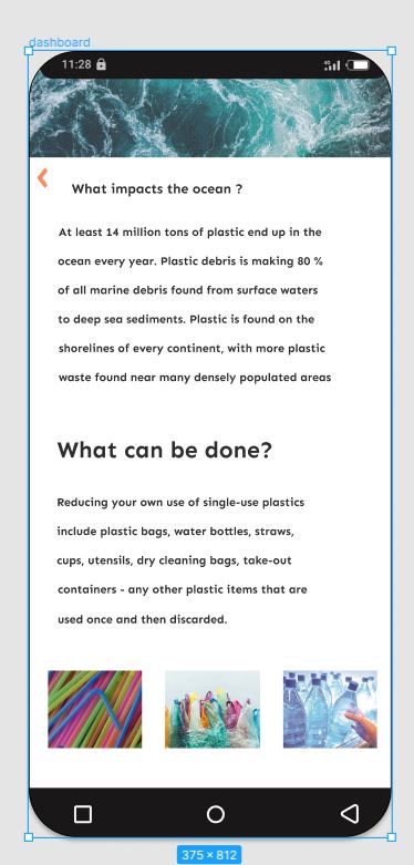
I’m working on designing this screen however, I’m still struggling with the alignment of the text.
Despite trying multiple times, I am still not satisfied with the design.
I posted a screenshot, can u please tell me if its readable and how to improve the look of the design to look professional (any tip or sources will be highly appreciated)
Thanks!!!