There are a few ways to break a new UI layout down, and I think you are thinking about the right things already:
UI Patterns
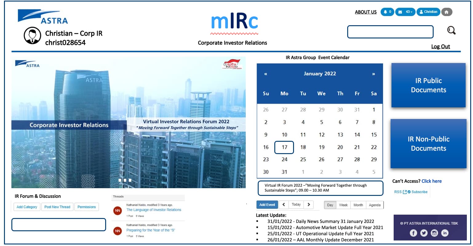
There are a number of standard UI layouts and practices that are based on how users process visual information. I always keep in mind eye-tracking patterns like F and Z-shape when laying out a desktop page, and add in thumb reach when considering a mobile layout. These patterns inform me where to put the most important UI components to the user and the brand in the layout, but also what I must do to prevent strong F-shape scanning and help the user visually find components on the page. For example I think your mockup conteracts F-shape scanning (in a good way) by having the heavy use of color blocks on the right-side.
NN/G Article on F-shape patterns
There is value in using design patterns from your industry and from your users’ experience. This can be a little tricky, but you want to provide your users’ with a familiar layout so you don’t have to retrain them on something new. This is tricky because often others in the industry may have zeroed in on using dark UI patterns based on bad intentions or data. For example, SAAS designs that downplay existing user logins for new user signups, this is a common pattern but was discarded quickly by the companies that pioneered it many years ago (Twitter). At the same time, even if you are designing a financial site, your users don’t exist in a vacuum, they may be more accustomed to social media site layouts by a large factor. When I do mobile enterprise and healthcare designs, I still have to take into account what mobile Facebook, Youtube, etc look like.
UI layout patterns don’t have fads and rarely have trends, any trends evolve slowly. Versus artistic styles that evolve relatively quickly and have fads that burn out. UI patterns change based on evolving forms of interaction, for example increasing size of mobile phones. There are also design pattern libraries that can help for inspiration for a variety of layouts:
UX Library list of UI pattern libraries
User Needs and Reality
Standard UI patterns are a good place to start, because they are based on tests and successes over time with users. However, the next step is user testing UIs and analyzing current usage if the organization already has users.
User testing layouts is about the easiest type of testing you can do. All you need are 5-second tests of your alternate mockups, asking the user to find (ie, click on) an item. There are tools that facilitate this out there, but it basically works by showing the user an instruction screen “Where would you go to find X documents?” and then show them the mockup for 5ish seconds and see how many click on the correct link/button. Just be sure not to lead the user and frame the questions with user goals in mind, not the label you used for the component. For example, as a frequent investor myself, it took me a while to realize what “IR” stood for. I don’t care what the company calls things, I’ve been taught by MarketWatch, CNBC, Motley Fool what type of documents I should be looking for.
This brings up another good approach that should happen more than it does, which is talking to users. Ask them what they look for when they are looking at investor relations pages, and be sure to ask “why” a lot to drill in on their actual goals. This really should be what drives every design, and hopefully reduces nonsense that internal stakeholders want to put into a design.
By “Reality” I mean also look at statistical usage of similar pages at the organization. What percentage is mobile? Be sure to look at landing pages, if the existing designs are anti-mobile or whatever, the pages may turn off mobile users beyond landing. For public pages consider any industry trends for device/time/regional usage that you can find so you can see how current pages stack up with what is happening in the industry. Most public facing layouts should have a responsive design approach from the start.
Stylistic Preferences
Style is still very important, even if it mostly should be considered behind patterns and user goals. It’s what makes the design standout and be memorable. This will largely be dependent on brand guidelines. What brand guides does the organization already have? Reach out to the marketing department, they generally hold the keys to brand documents. If you’re lucky and its a newer company you can talk brand approach with senior stakeholders or even the founders. You may be able to shift the design towards better practices or to what stylistic approach you have personally. In the past my most successful projects were always collaborative with the main internal stakeholders of the company or department. The stakeholders had an approach they wanted in design that went against the industry or the VP was able to see their contribution in the finished design while I shifted things towards better usability and accessibility. Some projects we deliberately went against industry stylistic trends (game UI style in a healthcare app), but still used solid UI layout patterns for usability. Our users loved it because it broke up the monotony of their work while still helping them. That is an approach I may never have felt comfortable doing without collaborating with my internal stakeholders.