Help needed in UX

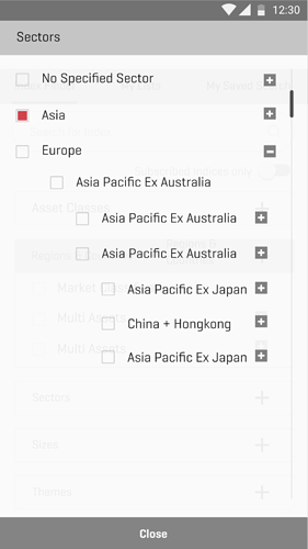
Can you suggest how can I implement a design which has 4-5 sub-folders(sub-items) like shown in the below image.
Problem: If I keep on adding the subfolders maintaining the same gap as the index, it tends to show a horizontal scroll which is not suggestible in a mobile app(I suppose).

Any ideas on this ?

Why did you chose a tree-view?

An alternative might be the so called “ipod menu” where every level has its own page.
Also an accordeon migh be usable.

You cannot always prevent the scrollbar … it depends on how many entries you have, how long they are (might be 2 or more lines), the available viewport aso.

2 Likes

Hi Ole,

I think ipod menu would be too complicated for this concept, as i want the user to be aware on what he has been selecting as there sub-sub-sub menu items for a single main item(Eg:Europe).
As in ipod menu, there will be too many pages to be shown for a single main item(Eg:Europe) and at some point of selection if user wants to refer to what he has selected till now then there will be chance for confusion.

Where as Tree-structure gives a clear idea on selection as you can see the total options available openly.

Horizontal scrollbar - i am not sure how good it is to implement in mobile app.(I have seen very very few examples for it.)

1 Like

To me it depends on the content. I would handle geo-location content different then basic main and sub categories, say like a family and its product. For the former I might go with sequential menu structure see Mobile Subnavigation the way Amazon handles their menu.

1 Like

Ok, lets ask from the other side … what exactly do you want to build? :slight_smile: