
Setting contrast to 50 helped. Thank you
Not a fringe problem at all I am afraid, it’s been a problem since the beginning of web design 20 odd years ago, its why you’ll see ost tables done with borders rather than grey stripes.
A plastic packer bottle is a bottle constructed from high-density or low-density plastic. Plastic bottles are typically used to store liquids such as water, soft drinks, motor oil, cooking oil, medicine,
shampoo, milk, and ink. The size ranges from very small bottles to large carboys. Consumer blow-molded containers often have integral handles or are shaped to facilitate grasping.
I had the same issue, I could fix it two ways:
Go to Monitor settings(there should be buttons on the monitor for this)
- Change the Picture mode to “Eco”
AND/OR
2)Change the HDMI RGB PC range( from 16/235 to 0/235)
Your grey-scale chart is very useful and confirms my belief that my integral Samsung laptop monitor shows greys correctly but my external Acer monitor does not. It’s a particular nuisance with Outlook 365 as its themes are very limited and the grey ribbon appears white on the external monitor, which makes it harder to read and thus slower to use. I have tried various suggestions, including the ones set out in this topic, but without success. My AMD Catalyst Control Centre for the Radeon HD 7640G graphics card does not show any pixel format options, changing default rendering intent to Relative Colorimetric in the Color Management dialogue made little difference and Display Color Calibration brought the monitor more or less back to my existing custom setting. Have any new options or ideas appeared since these suggestions were posted? I should love to find the answer!
I had the exact same issue with any light gray being washed out, and I was finally able to resolve it today! My external LG monitor has a VGA port and HDMI. I had this issue when I was using the VGA port + VGA to USB-C adapter (to connect to my Macbook). I switched to using a HDMI to USB-C instead, and I no longer have this issue. I read online that HDMI is better than VGA in terms of res + colors. I hope this helps.
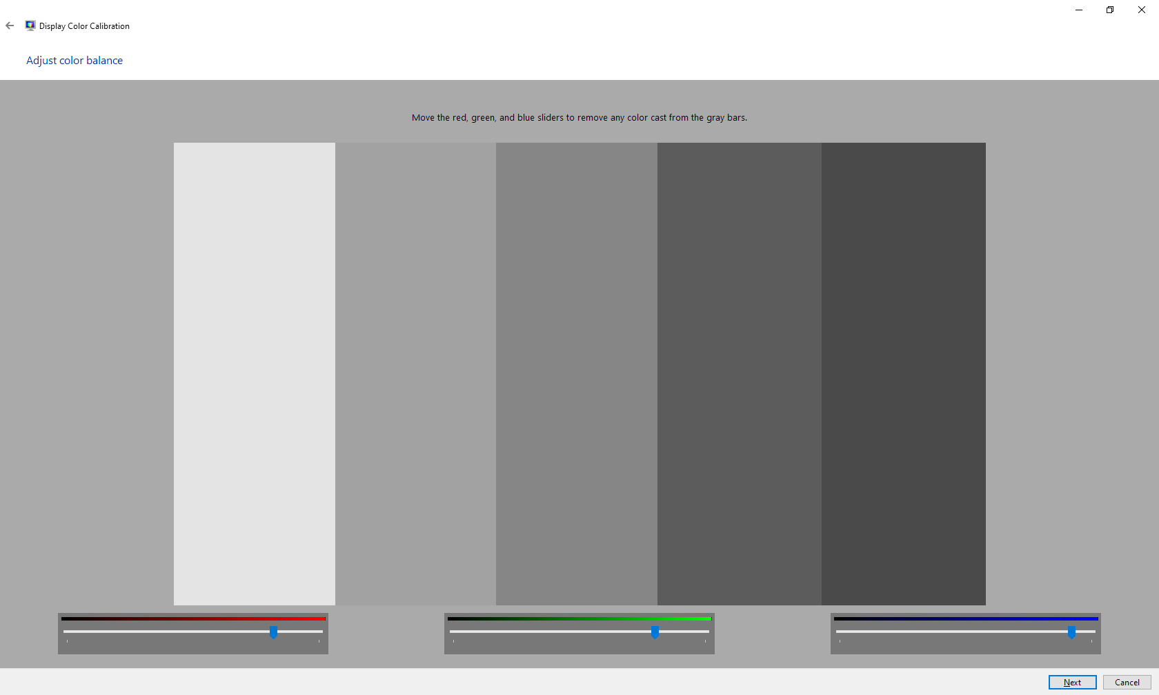
Color Management in Windows helped! It worked like magic. Specifically, you need to tweak the red green blue settings under “How to adjust color balance” and better to come back to this page while playing with is, and see the bars which someone has posted above.
I usually don’t comment but this was such a great help!  thanks a lot guys.
Resolved - I have a Asus FX706Ll which would not show light greys, for example Visio grid pattern, on the internal screen ie it could not differentiate between white and light grey, they both showed as white. I could fix this by reverting the graphic driver to the Microsoft generic driver but lost other features such as being able to adjust the brightness of the display.
Eventually I found the root cause of the issue, in Amory Crate > GameVisual it had been set to “Scenery”, selecting “Default” fixed the issue.
1 Like
I had the same issue. One day I noticed it was hard to read google maps because there was no contrast between gray and white.
In the end the solution was in Armory Crate. I had it set to Racing Mode which completely removes the light gray colors.
I had a similar problem, but the problem was not the Contrast, I had to navigate the settings to find “Range Extension” and change it from [Auto] to[Off]
Ah yep this depends what “game setting” you have it to - I think this will only apply to people that would have that kind of thing - that depending on your audience could be large or very very small!
I had the same issue one I was using the HDMI 2.0 cable. Tried everything and could not get the issue fixed. When I finally replaced the HDMI cable by a USB-C cable. Problem is gone.
I’ve been struggling with this issue for quite a while.
What I found is that you have to Search your printer model online and then download a ICC profile for it.
Then use the color management panel to upload that customer profile and that fixes it.
Test on multiple monitors: It’s important to test your design on multiple monitors with different configurations and color profiles. This will give you a better understanding of how your design appears across various devices. Pay attention to both high-quality monitors used by professionals and more common consumer-grade monitors.
I have an Acer XV5 Series/XV275K and to resolve the light grey colours not rendering on the screen properly, you need to go to Menu>Systems>HDMI Black Level and change it to Low. By default it is set to Normal. I am using a HDMI to usb-c cable to my Dell laptop and I too was having an issue where MS Visio files were not displaying properly, SAS studio, MS Outlook website was displaying properly. Anything with light grey was dang near invisible.
correction: SAS studio, MS Outlook website was NOT displaying properly.
Providing expert advice and guidance to clients on software-related matters, such as technology selection, architecture design, and project planning by MLSDev. Software development firms can help clients define their software strategy and make informed decisions throughout the development process.
Worked perfectly, thanks for the info!
You’re absolutely right, dealing with consistent greyscale representation across different monitors can be frustrating. Here are some strategies others have used to address this challenge:
Design and User Experience Considerations:
- Focus on Hierarchy and Contrast: Use clear visual hierarchy and strong contrast between important elements (like buttons) and the background, even if the lighter grey doesn’t show perfectly everywhere. This ensures readability and usability.
- Consider a Slight Outline: A thin outline around the buttons can subtly enhance their definition, especially for users on monitors with lower contrast.
- Test on a Range of Devices: While it’s not always feasible, try testing your design on a variety of monitors (ideally representing your target audience) to identify potential issues.
- Be Transparent (Optional): If consistency is crucial, you can consider adding a disclaimer explaining that some color variations might occur depending on the user’s display settings.