[Week 1] Bookclub: The Psychopathology of Everyday Things

Well I was explaining to @HAWK that I didn’t even realise that I had finished the first chapter and had started reading the second one. I am using the Queue app for Safari Books Online and I guess they didn’t think a signifier like ‘Chapter 2’ would be necessary :laughing:. What made me check where I was in the book was the introduction of a new concept and the fact that the chapter felt very long.

When thinking about feedback, I am drawn to the example of ticket validation machines at some train stations in Melbourne. The old ones used to tell you your remaining balance and if you have a low balance. Now, with the new ones you get a green tick or a red cross. I prefer the old ones so I can keep track of what I have been charged and see if it is correct. The skeptic in me says the new ones replaced the old ones so that there would be less overcharging claims from customers. You do have readers where you can check your balance and history to a certain extent but busy commuters aren’t going to find the time to do that.

Ah I had the displeasure of using SAP CRM for a data entry job not long ago. Your points apply to this for sure. They had to hire a group of us because of the influx of orders. While I would have been out of a job for that time, I think they could have reduced the time it took for order entry if everything was streamlined etc. 3 screens just to key in a few things - you could fit everything you needed on to 1 screen. Oh and you had to key in things in a special way to figure out you had a duplicate account at certain times. Really? :confused:

Their web based credit card data entry system was better since everything was on one page. However, I did accidentally press the wrong key but there wasn’t any proper feedback.

I did ask if there were keyboard shortcut keys for the SAP CRM but no one knew anything. The best things I could do to speed up data entry was use TAB & SHIFT + TAB, and organising my paperwork into various marketing campaigns so I would do less keying. Any changes to both systems would require the developers to make them. I don’t know how SAP can be customised in terms of its user interface, but the way that their system is designed is very cumbersome and needs reworking.

5 Likes

Greetings all from Sunny Spain!

I have just finished the first chapter.

I hope I’m replying in the right place, the signifier on my iPhone wasn’t too clear on where to comment on this thread ;-).

For me a few memories popped into my head.

The first being my grandad walking into my dads glass sliding door when I was younger, he knew the door sliding but used to get really angry with my dad asking him to add a sticker (signifier) so he could tell if the door was open or not.

When I read about mapping it made me think of my current house here in Spain, we have three light switches together and the one closest to the door should control the outside light. Annoyingly it’s the one furthest away which does. To this day, I still get it wrong!

Key points

If an afforance is not perceived or signaled it is pretty much useless and no help to the user.

It’s important that a users conceptual model is the same as the design/developers.

Realating to my work place.

We created an app which a user could log in using their finger print. However when I user tested it I found that when the user logged out and then tried to log in again with there finger print, the app asked the user to login with username and password.

When I contacted the developer he said this was because the user was “logging out” to user the finger print id and that they needed to just close the app.

I believe this is an example of the user and developer having different conceptual models.

Let me know you thoughts.

3 Likes

Ha! I’m also bad at this. We have several banks of 4 light switches and I try them all every time, before getting the right one. It drives my bf crazy.

1 Like

I’m enjoying this discussion! Let’s keep it going as we have more thoughts about Chapter 1 topics. Some great personal stories, and I love that we’re collecting favourite quotes—they capture a concept well. We should tweet a couple, eh @HAWK?

I’ve posted some starter info for chapter 2, so head over there when you’re ready.

I was looking around for a copy of those Catalogue d’objets introuvables books by Jacques Carelman that Norman mentioned when he was talking about the coffee pot for masochists, and remembered there was a website that shows a lot of the products: http://impossibleobjects.com/catalogue.html

Have to say the economic faucet, electric hammer and cuckoo watches are my favourites. :slight_smile:

2 Likes

Haha this is amazing!! I really liked the lateral rocking chair, Imagining myself on the chair… :laughing:

1 Like

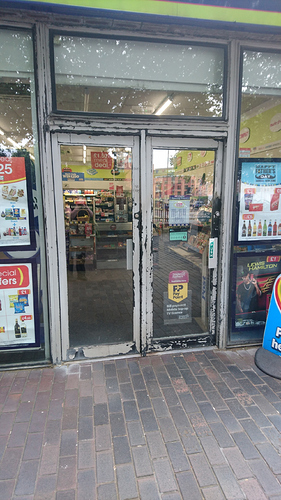
An example I came across just now.

A shop with double doors and no obvious exterior handles in the middle, my presumption would be that you could push either or both in the middle to gain entry.

Actually no, you have to push the right hand door on the right hand side. It is not a double door but rather two separate doors side-by-side with the hinges inbetween the doors.

When I eventually got in and spoke to the lady behind the counter. She said that lots of people make the same mistake. I’m guessing no one has bothered to report that to head office.

3 Likes

Just finished chapter 1
I was amused by the idea that watches and phones could eventually merge! (2013 edition)

I’m thinking a lot about my clients concept models and how I need to know what they are before we can talk about issues they have.
This would get around the misuse of terms that causes confusion.
“I want a button on the home page” but meaning “I want a button in the menu I can see from every page and will notice when I’m on the home page”

I’m liking the approach to read a chapter a week!

2 Likes

Good call. I’ll line some up.

That’s good feedback. We were wondering about the pace.

I’d love to know what a system image is?

A system image is essentially the information a user can pick up from looking at the object/product/device itself.

This article does quite a good job of explaining the relationships between the different conceptual models.

2 Likes

Thank you for asking that. I was going off of context, which got me close, but now I have a real answer. :heart:

1 Like

Hi all. finally posting here. This first chapter of Don Norman’s book addresses what we can learn from just looking at products before we even use them and how the balance between affordances and signifiers should create good design, but often overuse of or improper signifiers end up hindering good design. Don discusses how we all come with a built in conceptual model of how we expect items to work, but often over designing items (building them in unfamiliar formats or adding too many features), especially those with technology involved doesn’t create a better design, rather it leads to user stress and frustration. Simplicity is best. It is my belief, and Don’s I think, that good shouldn’t cause stress but alleviate it. I understand companies want their products to look attractive, but that should never trump functionality. A balance between the two should be struck. And in the end if a balance can’t be reached usability should always edge out because a usable product of good quality will always be attractive to consumers.

3 Likes

Hi everyone! I’m a bit late getting started here, given that Week 1 coincided with the week of a major conference I had been preparing to present at. Excited to jump right in now that I’ve recovered from my awful travel schedule. :slight_smile:

I’m already glad that I am reading this book, seeing as my skills/ties related to UX are more compatible with UX research than UX design. I feel like I’ve learned a lot from this first chapter already!

Key Points

To summarize the major chapter points into chunks:

  1. Machines are logical and require accuracy and precision; however, people have expectations and tend to struggle with precision/accuracy. To design effectively, we must accept people for who they are rather than who we wish them to be. Even experts make errors, and anticipated errors should influence design. Human-centered design (HCD) accommodates for people’s needs, capabilities, and behaviors.

  2. The two most important characteristics of good design are discoverability (knowing what actions are possible and when/how to perform them) and understanding (knowing how the product is supposed to be used, in terms of controls, settings, etc.).

  3. _Discoverabilit_y manifests through the effective application of five psychological principles: affordances (the presence of or prevention of a relationship between the properties of a physical object–such as a product–and the capabilities of an interacting agent–be it a person, animal, etc.), signifiers (which take the possible actions conveyed by affordances and provide clues as to where those actions should take place), constraints (I think this is the prevention of attempted actions?), mappings (the relationship between the elements of a product, such as between buttons on a smartphone screen and what those buttons actually do), and feedback (appropriately communicating the results of actions so that users are informed but not annoyed, distracted, etc.).

  4. Understanding manifests through the effective application of the conceptual model (mental models of how things work that can be used to predict how things will behave and to know what to do when the wrong action is selected).

Memorable Quotes

“No matter how brilliant the product, if people cannot use it, it will receive poor reviews. It is up to the designer to provide the appropriate information to make the product understandable and usable.”

“Design requires the cooperative efforts of multiple disciplines…quite often each discipline believes its distinct contribution to be most important…the hard part is to convince people to understand the viewpoints of others, to abandon their disciplinary viewpoint to think of the design from the viewpoints of the person who buys the product and those who use it, often different people…It is when the disciplines operate independently of one another that major clashes and deficiencies occur.”

Takeaways and Reactions

Does anyone else remember the show Top Design (which was on the Bravo network, for those of you that have ever had Bravo)? It was an interior design reality show competition. I remembered being excited by the premise, but upon watching it I remembered thinking that me and this show just didn’t “click” for some reason. Designs that were heavily praised came across to my uncultured eye as looking…well, rather bland and unexciting. “What on earth is so special about that boring room?”, I wondered. The show didn’t last past the second season–and upon reading Ch. 1 of this book, I started to understand why: That show was a show for other designers, not a show for consumers (the viewers). Designs that were being praised were winning on their technical merits, but those merits weren’t translating into an exciting experience for viewers.

On a related note, this chapter did an excellent job of illustrating the potential points of conflict between designers and numerous other members of a product design team. As someone working as a change agent in my current job, these cues are important to know…and just as UXers are expected to have empathy for users, so too must we have empathy for our colleagues from other disciplines. For example, I can understand how frustrating it must be to follow the “rules” of developer logic to create a knockout draft of a product…only to be told that people simply can’t understand it or “don’t like” it. It can be demoralizing when your best ideas aren’t embraced by consumers, and I can see how it would be tempting to respond defensively by calling users “stupid”. (I’m not saying that’s acceptable, just that I recognize it as a human response to frustration.) It seems that the right tone, and a shared sense of a human-centered design mission, absolutely must be put in place and enforced early on if product design teams are to be successful.

2 Likes

An example I came across just now.

A shop with double doors and no obvious exterior handles in the middle, my presumption would be that you could push either or both in the middle to gain entry.

Actually no, you have to push the right hand door on the right hand side. It is not a double door but rather two separate doors side-by-side with the hinges inbetween the doors.

When I eventually got in and spoke to the lady behind the counter. She said that lots of people make the same mistake. I’m guessing no one has bothered to report that to head office.

Wow! The more you know, the more designs start irritating you in ways that you would have overlooked before. That picture is a great catch.

I also must say that I identify with poor Norman’s “Norman doors” story. Does anyone ever lay awake at night and ruminate over all the ways you’ve embarrassed yourself in the past? Way too many of my stories involved encounters with doors like these. :joy:

2 Likes

Hey! Thanks for sharing a link…it’s amazing to see :smiley: those…

1 Like

This chapter IMO is a timeless classic. I love that his perspective is rooted in the design of physical objects because its so easy to grasp and so portable to other disciplines. Each fundamental principle he lists is so elemental its hard to miss their impact on my own work. I’m currently working for Amazon Web Services creating UX for developers, dev ops, cloud architects and IT folks. The kinds of tools we’re building can be really complex, and also mission critical - the wrong interface can bring a website down or blow up a database. So making sure our users have the right mental model, clear signifiers, and appropriate feedback is important. So great to read this stuff again - seems like it takes on more significance the more I grow in my career.

1 Like

Great summary @docBOOM . “To design effectively, we must accept people for who they are rather than who we wish them to be” - love this quote, mind if I use it? :slight_smile:

1 Like

Interesting. Have you read the book before? How long ago? If yes, do you have any take aways this time (aside from what you already mentioned) that you didn’t realize were there the last time?

Being late for this chapter I agree that this chapter is an alltime classic. I also love rhe summary of gmastery … on the point.

The fundamentals principles are so rru and you can’t repeat them often enough. I also recognized that I sometimes misused the “affordance” when it was in reality about signifiers.

Regarding mapping I’ve a bunch of experiences from the human orientation/navigation area. It is amazing how people map the whole world based on their experiences from the past. This transition/bridge between the mental picture and the real worl usage is all design is about. It’s kind of magic and I love to take care about it.

Really worthy was for me also the model discussion. Just to often we forget about that our conceptional model differs from the users one.

Have a nice day guys :slight_smile:

1 Like