hi, folks!
We are working on a task related to the validation messages for the web forms.
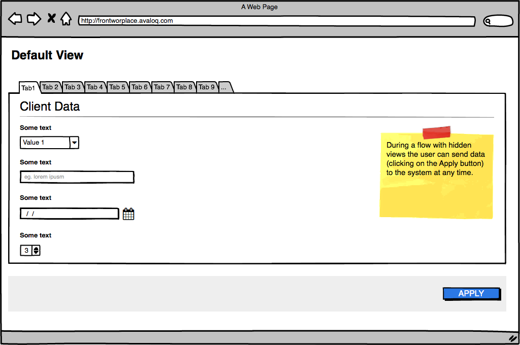
The use-case is this one:
- user has to face a complex form (more than 30 fields)
- we decided to split the web form with tabs to decrease the cognitive overload
- due to the business logic, the user can send the form to the server since the default view (some fields are pre-filled)
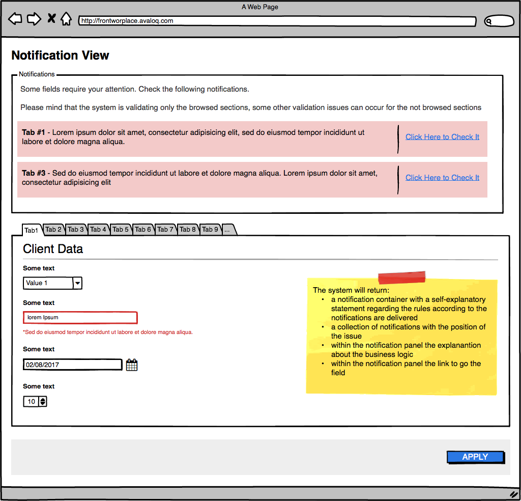
- due to the tech/business constraints we offer the validation only for the browsed TABs
this is the wireframe for the MVP solution we want to ship:
1 - Default
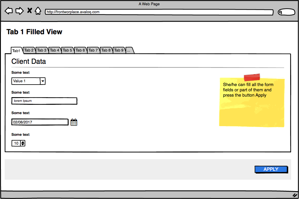
2 - Filled
3 - Server response
What do you think about this solution?