Portfolio reviews (from Louise's AMA session)

If you were in Louise Campbell’s AMA session today and you want your portfolio reviewed, please post it (or any follow up questions) here.

To manage expectations, it may take a week or two to get through these and everyone is welcome to give feedback – this isn’t a formal process.

2 Likes

Thanks! I always am open to getting feedback on this: http://gregor.smallgreendog.com
And I’m also curious to get some ideas of how to better promote one’s portfolio!

2 Likes

Hello,

Thanks for the great AMA. I would love some feedback on my portfolio.

Main site: http://www.annedougherty.com

Direct portfolio link: http://www.annedougherty.com/portfolio

:slight_smile:

2 Likes

I’d like feed back on my portfolio at www.serviceease.net

I straddle Customer Experience & User Experience but need more experience.

2 Likes

I would like to have my portfolio reviewed. https://son25anthony.myportfolio.com
Please give me advice on how to make it better. Thanks

1 Like

I missed the AMA but read through this morning. I’d love to get some feedback on my portfolio:

http://daniellemyoung.com/

I’m a multidisciplinary designer. I’v been testing what title works best for me: UX Research and Design, Product Designer or Digital Product Manager. I’ve also been doing a lot of Business Analyst work as well. Not sure how to synthesize all of these things.

Also all of my recent work is covered by a Non-Disclosure, so I’m limited to how much information I can display. How should I note this on my site?

Gracias!

1 Like

Hi! Thanks for such a valuable opportunity!
My portfolio is on my website www.elisabethraff.com.

I’m in the process of reworking, because I have done more work and would like to broaden a bit to include service design. So I’m most interested in how the information is provided - is it best to have them all as case studies? Are they too wordy/how do I make info easier to glean?

Anyou suggestions welcome! Thanks so much!

Here’s my portfolio: http://polymathsolution.com/new-portfolio/

I’m about to completely revamp my portfolio, but can still use constructive criticism.

One specific question: my portfolio is currently part of my freelance site … should I:

  1. keep my portfolio as part of my main site?
  2. create a subdomain for the portfolio? (portfolio.polymathsolution.com)
  3. purchase a new domain name and hosting just for my portfolio?

I’m leaning toward the second.

@smallgreendog thanks for posting! Your portfolio is cute and memorable! I like it. Please let me know what you want the outcome of promoting your portfolio to be? What are you doing now? What are your career aspirations?

@anne_dougherty thanks for attending. What are you struggling with right now? What’s not working for you? Because to be honest your portfolio looks fine, but then I’m not hiring you for a specific job, so suppose I was, how you you present your portfolio case to me? :slight_smile:

@rvaelle - thanks for posting! Some high level notes I would love to share with you…

  • When potential employers arrive at your site they do so with a 'bucket-ful of hope" it’s up to you to make sure it stays full :slight_smile:
  • Your name is the most powerful way for people to instantly connect with you (don’t make me think) eg. www.lisadancedesign.com (or something similar would be perfect)
  • Your CV is an instant narrative of your work and I’ve seen designers use this as a homepage with link to their work from there very effectively:
  • Your CV would be perfect for that. http://www.serviceease.net/wp-content/uploads/2016/09/Lisa-D.-Dance-Resume.pdf
  • Start with most recent work at the top.
    -Include results: “Completed user research and customer journey mapping workshop to improve church’s first-time visitor experience” How many extra customers did this result in? Include you results on your CV and in your narrative.
    -Potential employers want to have “wow” moments when looking at your CV or site (to keep the bucket overflowing) the results you got go towards doing that.
    I hope that goes a small way towards refining your offering.
    Thanks again, L

I’ll definitely take a look - working my way through, you are up next!

Hi Louise! Thank you so much for the wonderful compliment. I appreciated your having the session last week as well.
I am currently looking for work as a UX designer. I have done freelance work in web design and front-end development until now, but I really want to focus on UX projects going forward, so would like to land a job with an agency or in-house… even contract (longer than 6 mos) would be great, if it lets me sink my chops into this career path I really love!

I am doing a volunteer project right now, collaborating with some other UX designers on a web platform for international video tutorials for kids… which is fun… but if I can do this and get paid, well, that would be awesome!

Hi Louise,

Thanks for taking a look at my portfolio. What I’m struggling with is how to present my experience, which is mostly on the content strategy and web management side, in a way that highlights my skills accurately (think less T shape and more broken comb shape).

If I were trying to present myself to you for a jr or mid level UX designer job at an agency I would probably highlight my process, show that I do have that broken comb shaped experience but presenting certain artifacts that illustrate various skills like:

  • on a project I got senior managers at an organization to prioritize and focus their audience assessments quantitatively from “general public” so that in a redesign we could determine better top tasks to highlight for those more important audiences;
  • on a different project I took an organization how had the self-professed value of being “highly visual,” and that had the photo library to back up that claim, from a high whitespace, text heavy design to one that leveraged that photo library;
  • on another project I worked with a client to simplify an IA to focus their intended users more on what was both the users’ and the organization’s primary goal: converting visitors to participants.

I am just concerned that because I have a lot of experience I’m not providing any “wow” moments.

I haven’t forgotten you all. I’ll make a start on working through the portfolio feedback this week!

Ok, tag teaming in with @Louise here.
I’ll jump down after the ones she’s started, which means you’re up @son25anthony :slight_smile:

Forgive my brevity, but I think bullet points are probably going to give you the most easily actionable feedback.

  • My first impression isn’t bad, but it’s slightly underwhelming. If I was looking at a bunch of portfolios, I’m not sure this would stick out in my mind. I’d consider adding something (colour/imagery/logo/something) that people will associate with you in their mind.

  • You’ve optimised for a fixed screen size, which isn’t mine. It throws things out a bit


  • The descriptions at the top of your case studies are useful, but they could do with a proof read and consideration around contrast. The copy is very hard to read. This is a handy tool for checking that your levels are accessible.

  • It’s awesome to see images of your sketches and the stages that you went through, but you need some form of annotations. I want to understand your process and the thinking that went into each stage. Maybe a summary of learnings at the end of each, as well. @chrisoliver does a really good job of documenting his case study, which might give you some inspiration.

  • There are a couple of accessibility issues around font size and contrast on your About page. White on light grey for your heading and the very small font on your resume need a bit of attention.

  • The paragraph about your background is great but could do with breaking up a bit. It’s a pretty solid block of text and the sentences are pretty long.

  • It would be great to see some contact info alongside the form on your Contact page. My natural inclination is to look at your LinkedIn page, and I’m more comfortable with an email address than a generic form. It feels a little impersonal.

Hopefully that gives you somewhere to start. I’m very happy to revisit at a later time if that’s helpful. :slight_smile:

@discodelphia – sorry for the wait Danielle.

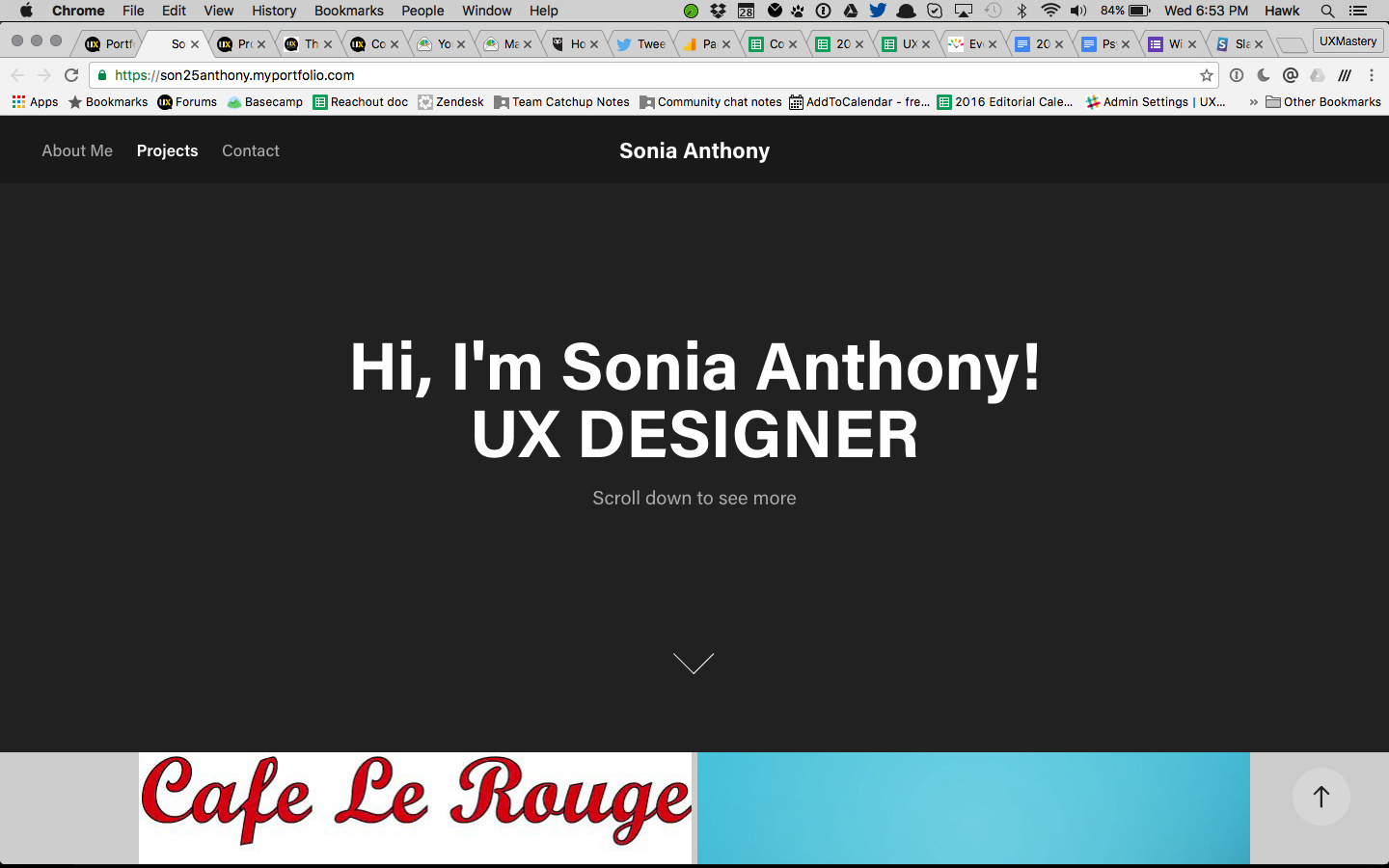
Your portfolio is clean, simple and easy to navigate. I think you incorporate the right amount of personality, and the images that inspire you are an interesting addition.

What is missing here is an outline of your skills, experience, and the tools you use. I don’t get a feel for what aspects of UX you’re strong in.

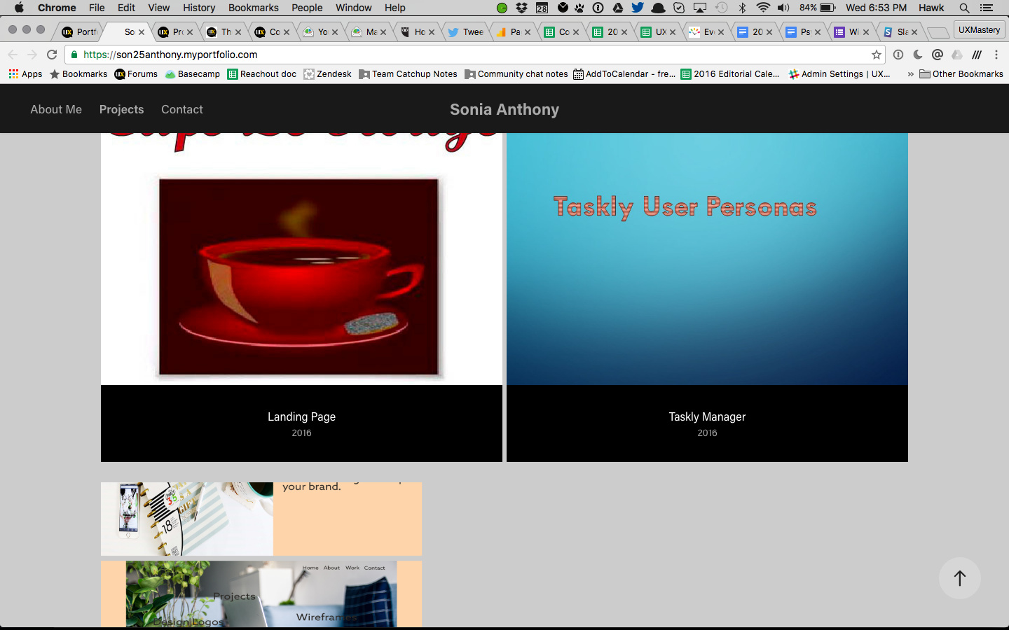
You have a good number of work examples, but they’re not well documented. They could do with annotation, or writing up as case-studies. You haven’t demonstrated your process or how you came to the deliverable.

Does that give you somewhere to start?

Ok @elisabethraff – here you go.

  • I like that your entry is straight to the about page and that you incorporate some of your personal story into the blurb, but the page is a bit underwhelming and lacks individuality. I’d consider adding something that makes it stand out as more memorable.

  • Your base font size needs to be increased (to at least 14pt) for readability. It’s a bit on the small side. The contrast is good though.

  • This is a personal preference of mine, rather than any kind of best practice, but your site lacks any contact information. There is no direct email address (I find contact forms at bit impersonal) and I’d consider moving your LinkedIn and Twitter info up onto that page also.

  • You’ve done a great job of documenting your case studies. Your process is well explained and your imagery and annotations are interesting. Adding a couple more would round things out nicely.

  • I really enjoyed going through your Other Work. You’ve done some interesting projects. :slight_smile:

  • A brief downloadable resume would be a great addition to your portfolio.

In direct response to your question – no, I don’t think your descriptions are too wordy. If anything, the readability needs work (see font size above).

Best of luck!

Hi @zcademy

I’d create a subdomain.

  • I love the little personal tips you drop in (masonry, rivers etc). Reading your story felt like an adventure and I got to know you. I think that’s great.

  • Accessibility wise, your main navigation could do with a significantly larger font size. What you have now is a bit incongruous with the flyouts as well.

  • The images in the blue bar at the top of your portfolio don’t work in the latest Chrome for Mac. The hover effect works but clicking has no effect.

  • You do a great job of explaining your projects, but there is no demonstration of process here, and a notable absence of UX case studies.

  • I don’t get a sense for what kind of work you’re looking for from your portfolio – that might be a useful addition.

I’d love to see this again when you’ve reworked it. I hope some of the above is helpful during that process.