Can I get some feedback on this project overview?

Hello,

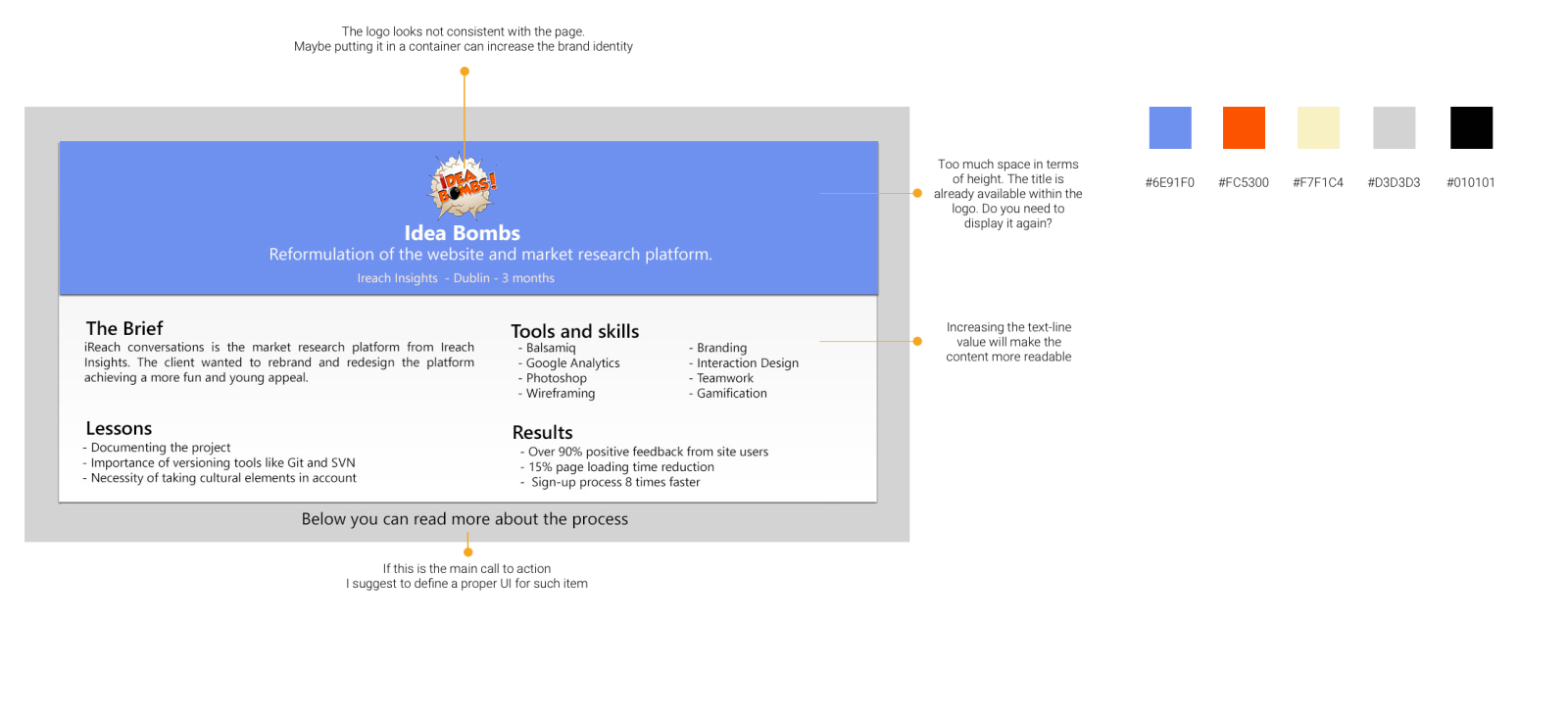
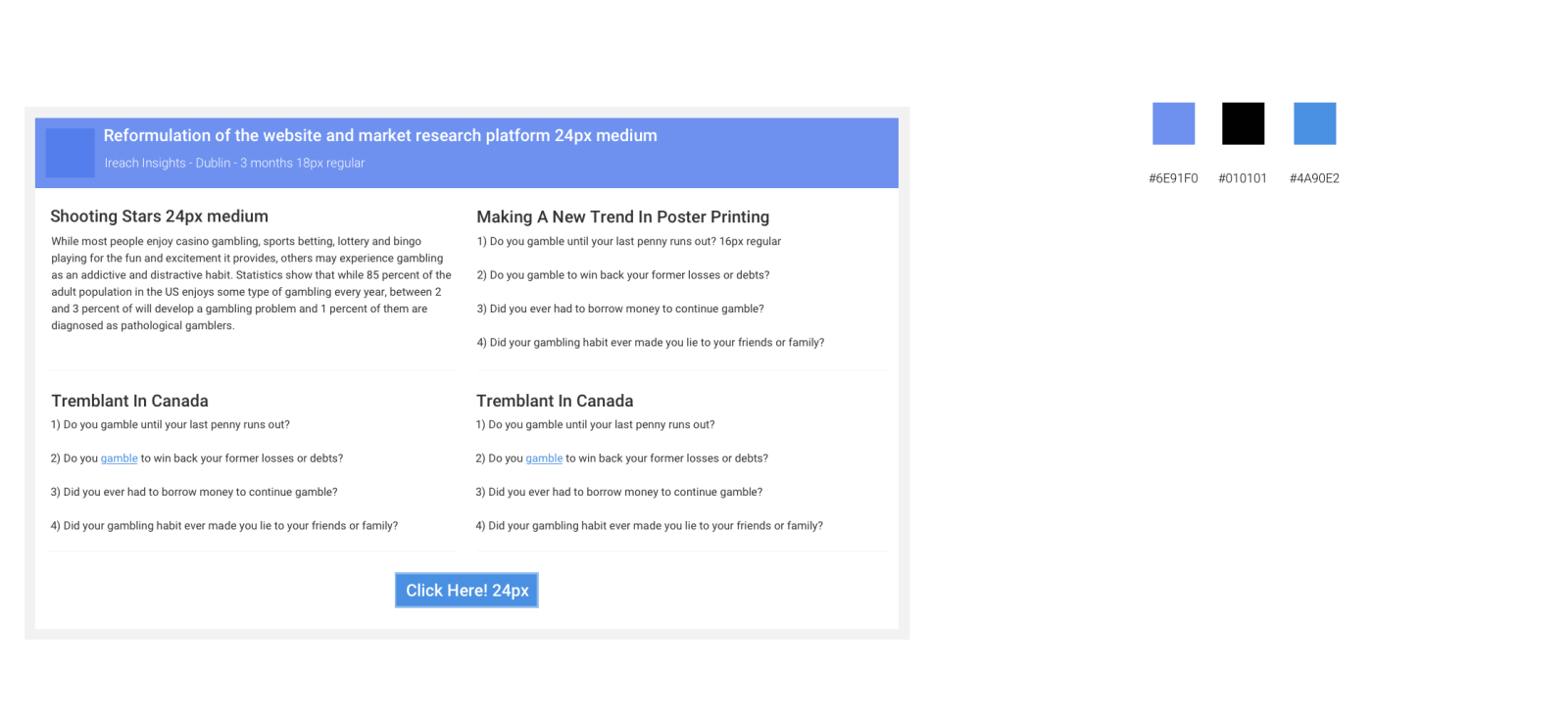
I’m trying to build a nice portfolio where I go in detail over the design process, sketches, wireframes, research, etc, but then I’ve figured that would be nice to have a quick project overview before going to the long detailed version.

I just came up with this template and I would appreciate any feedback on the layout, design and copy\content.

Thanks in advance,
Sam

hi @samuelddc9, actually I believe is a good approach.
I’ve got some questions for you:
which type of deliverable is this?
Is it a wireframe, mockup?
Which kind of "definition"are u showing us, hi-fidelity, mid-fidelity or low-fidelity?

:wink:

Thanks =).

Basically everything (even including a little bit of backend coding),except for full deployment and mass split tests,as I left the company before we could finish everything.

Wireframing --> Branding \ Visuals \ -> HF mockups on Photoshop -> CSS\HTML\JS coding \ then Implemented AB tests on the code.

Why?


EDIT:

Oh, sorry. I Misread your post. I would say that it is a high fidelity mockup to be converted to html on my website. But for now my portfolio is just on Behance, and as it doesnt allow proper formatting, this image would be the final deliverable.

hi @samuelddc9
here you can find some comments on the current solution

here I tried to reduce the complexity in terms of color palette, UI components and typography

I hope it will help :slight_smile:

2 Likes

I love this idea Sam. Anything that streamlines a process for busy people is a good idea in my book.

@dopamino offers some fantastic feedback, especially around the banner space.

My main observation is around the fully justified text in the Brief paragraph – I find it a bit awkward to read.
I also think the design would benefit from more padding around the headings.

2 Likes

THX!

@samuelddc9
just for your information I stumbled on this article about the logo position: https://www.nngroup.com/articles/centered-logos/

Thanks a lot for the feedback @dopamino

“Text line value” = “line height” ?

Actually I just added the “Read below” to post it here, indicating that there detail would be available.

Very good point about repeating the name… in other situations the name may not be visible included in the logo as in this case and i thought would be good to keep a pattern, but I don’t really know…

Is it a problem to have many colors?

@HAWK

Thanks! very good points, Justifying everything is a bad habit of mine. And I will try adding more padding and see how it looks.

1 Like

@dopamino
just for your information I stumbled on this article about the logo position: https://www.nngroup.com/articles/centered-logos/

Really interesting and useful article.

I believe it doesn’t apply to this case, as there is no navigation involved, is just the plain image offering a summary of the project.

I plan to use it as a header for the projects on Behance, for instance: https://www.behance.net/gallery/38567945/RPG-Helper

yes correct!

No is not a problem, from my POV, people do love color!
Adding values to the color palette means to invest more effort in maintenance and future enhancements in terms of consistency